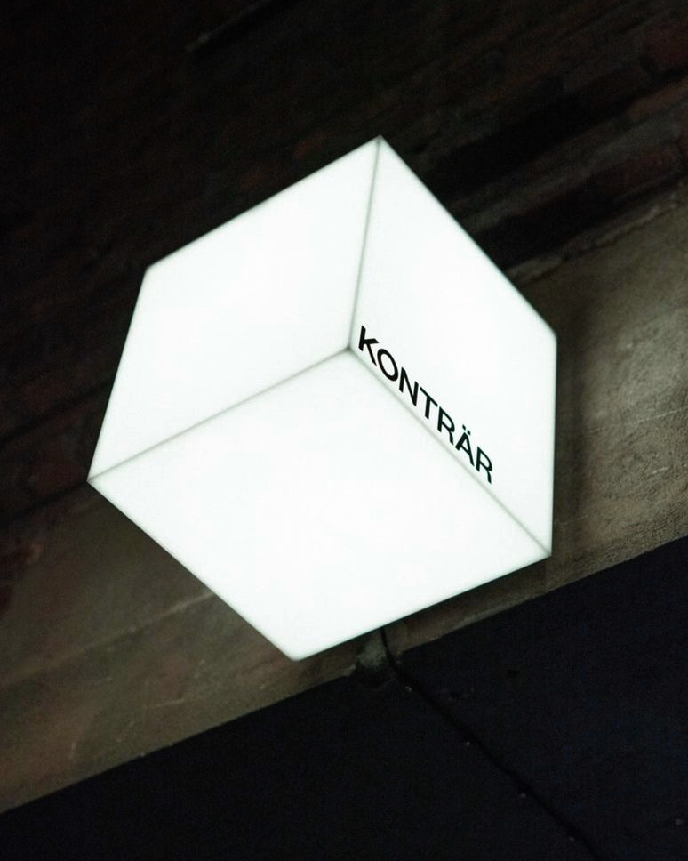
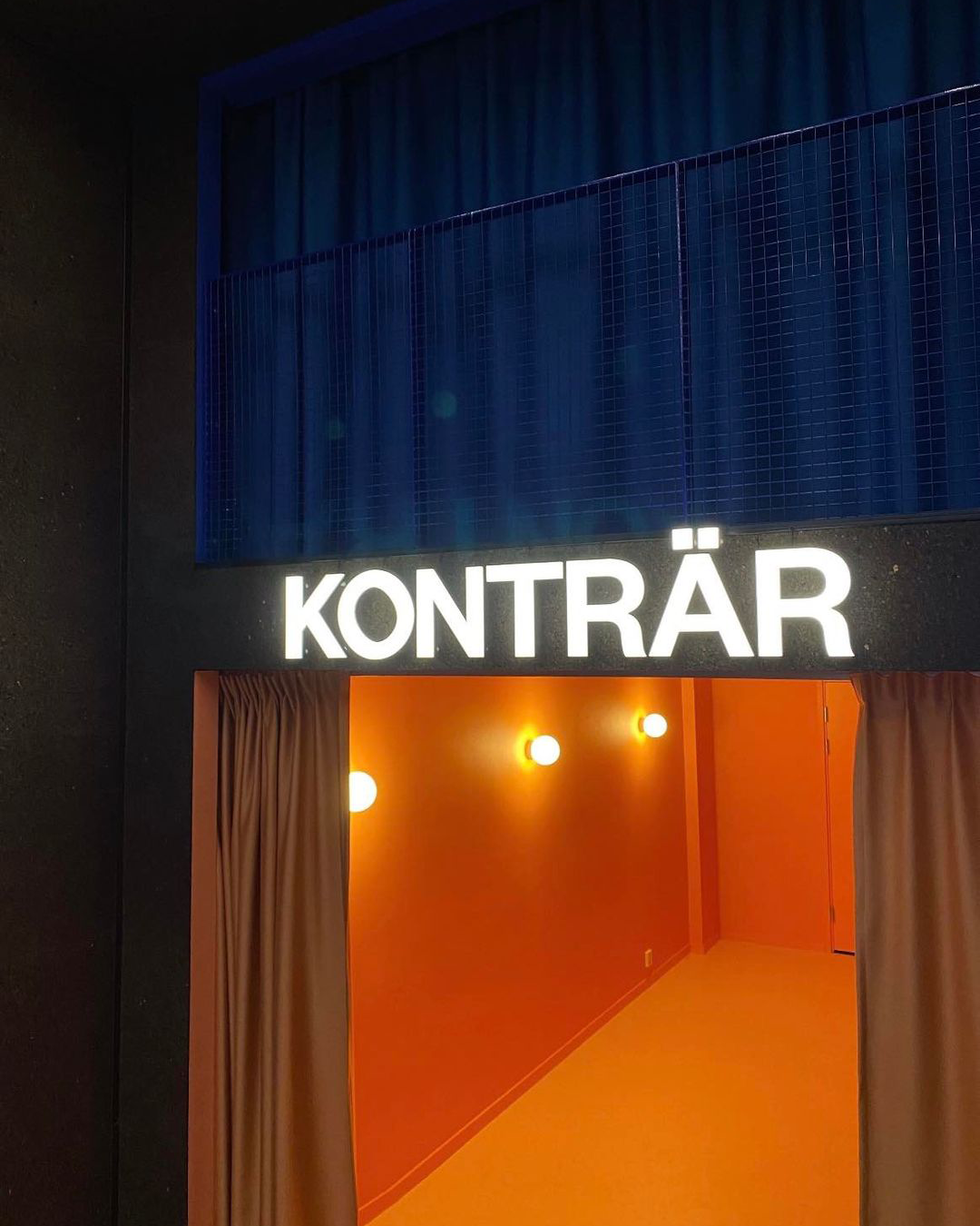
Using Founders Grotesk we created a wordmark with a hint of something that was optically odd.
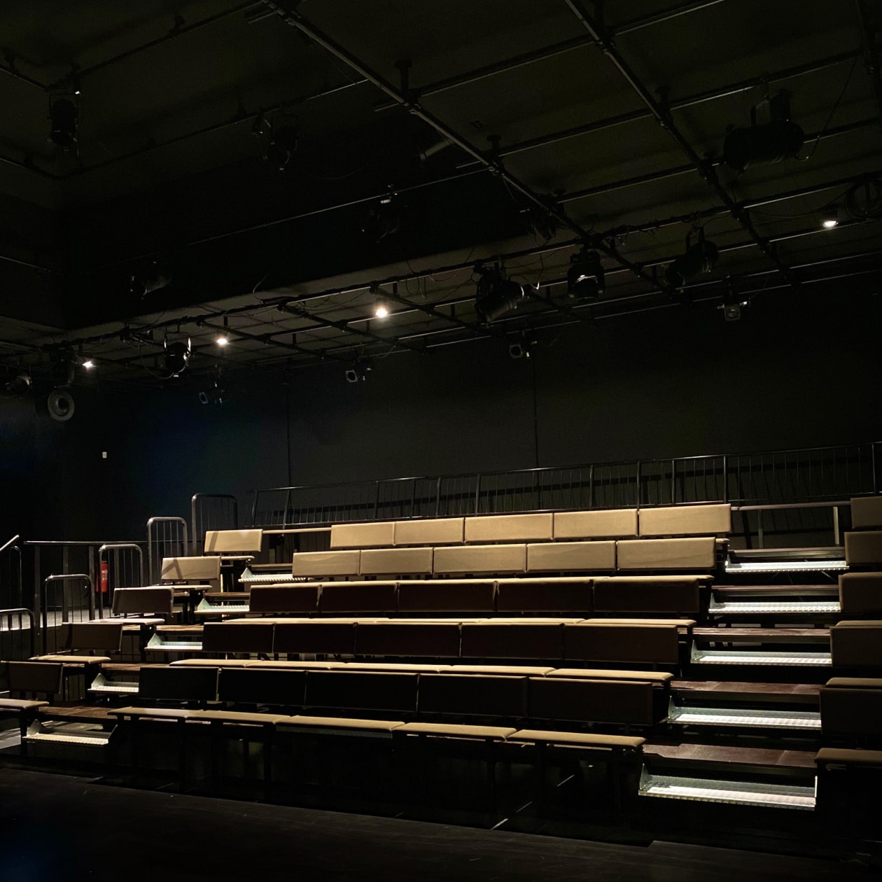
The stage is often called the ‘Black Box’. This room naturally became the symbol for the brand, and an element to play with graphically.
The cube switches color for different states of the venue. This live interaction is also synced with the website. With the simple three colored states we aim to create a pattern of recognition for Konträr’s audience.
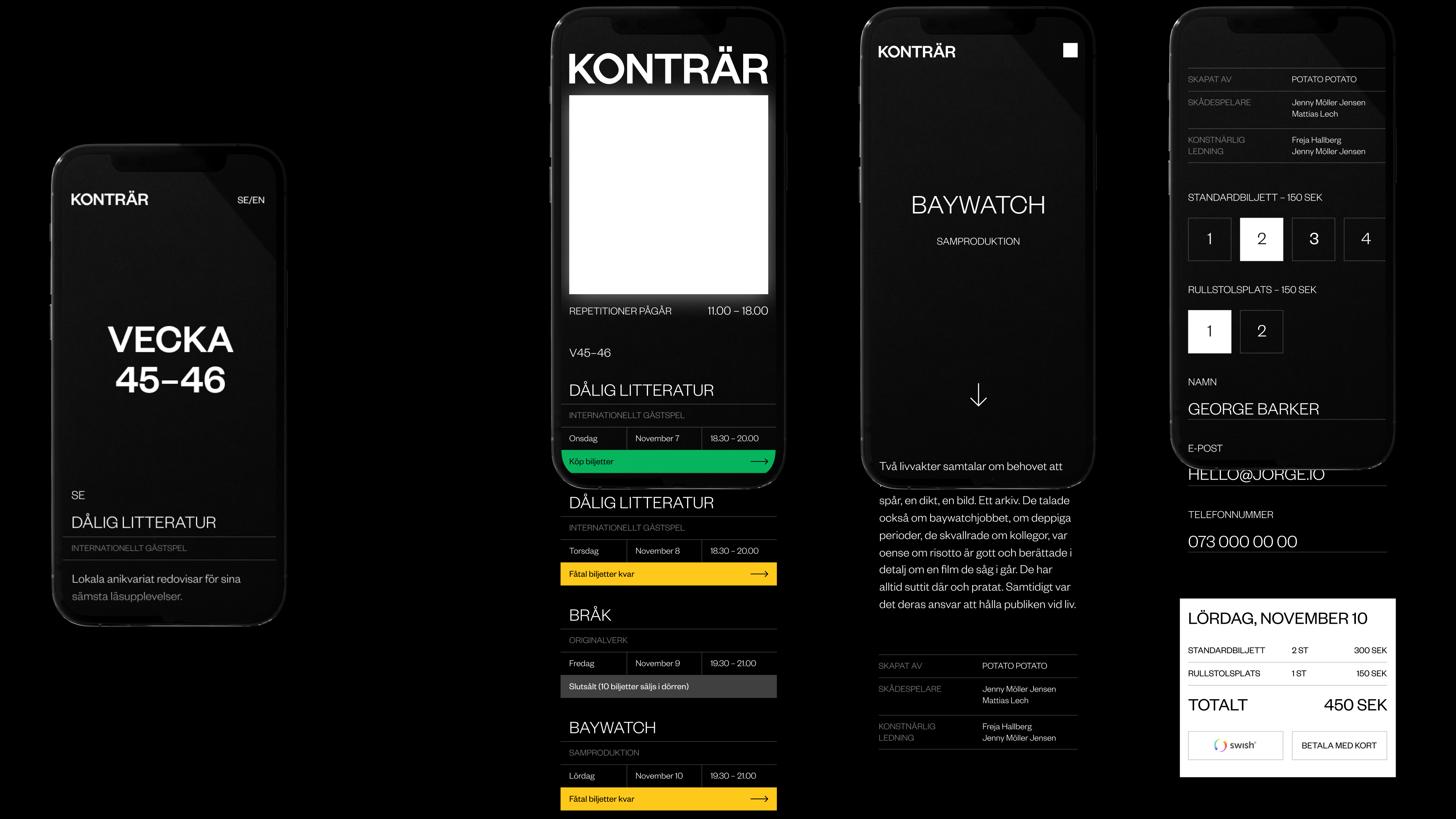
The website is built up on two different platforms. One site that is easily accessible for new and intrigued customers. And the other one linked through the weekly newsletter to buy tickets.
Credits
Navet Stockholm