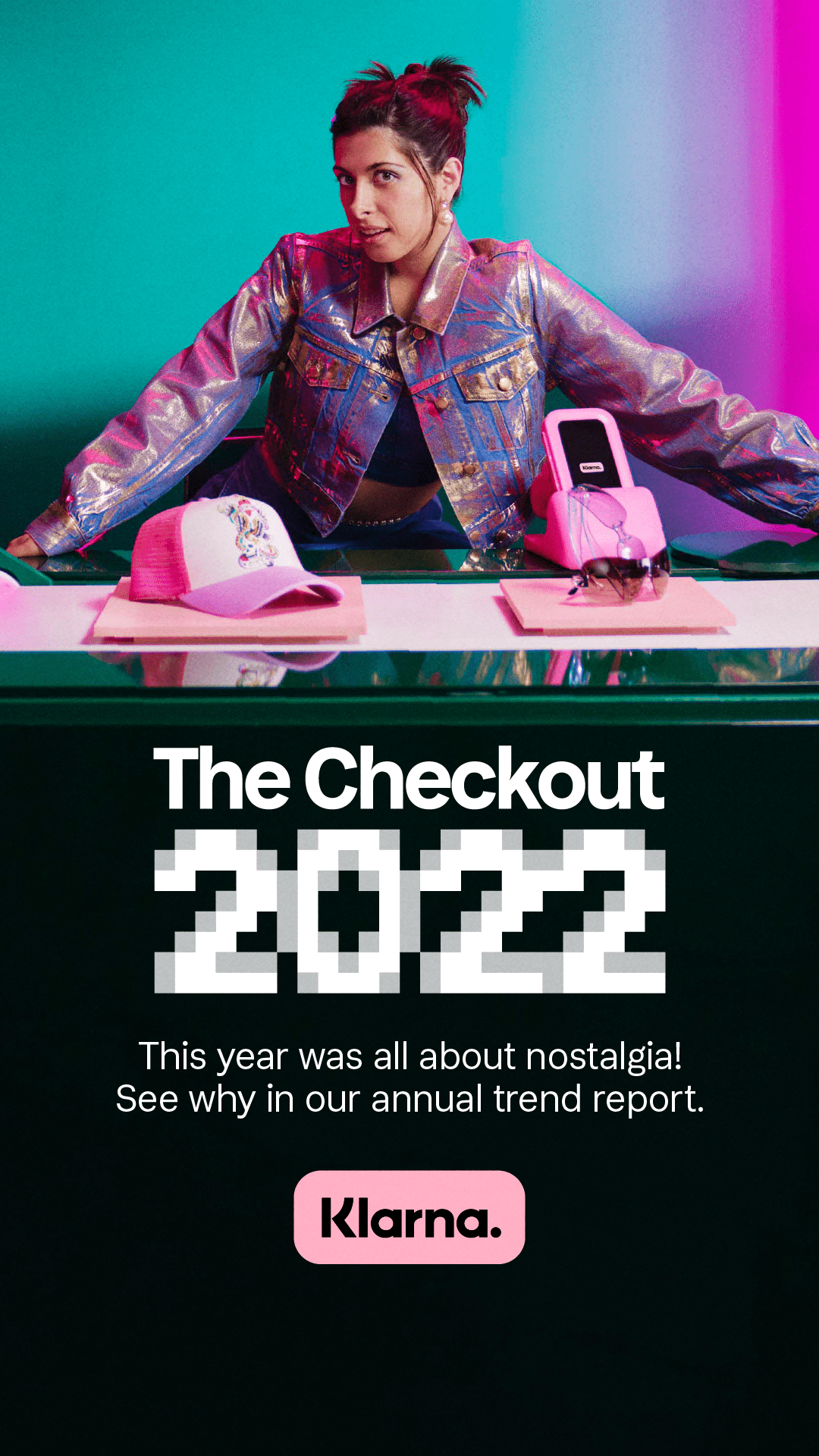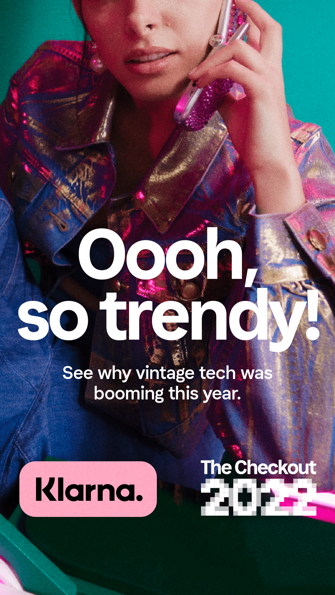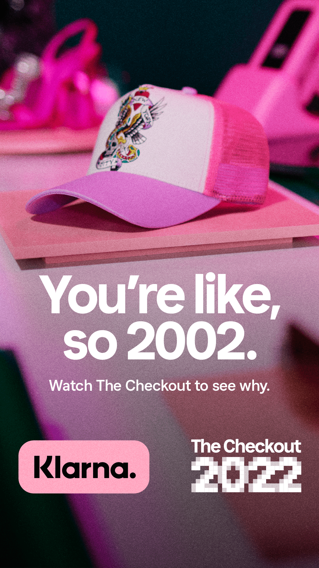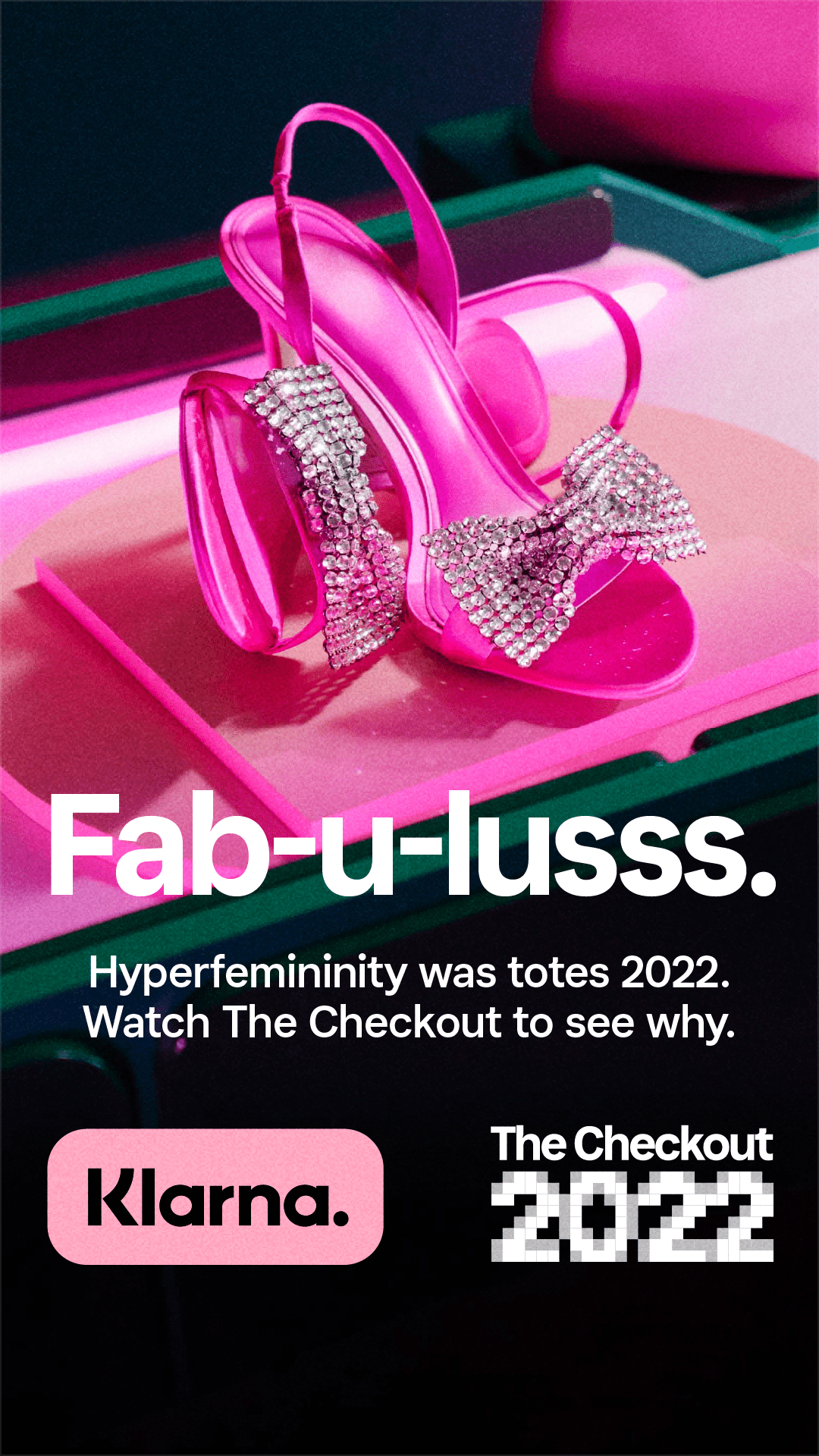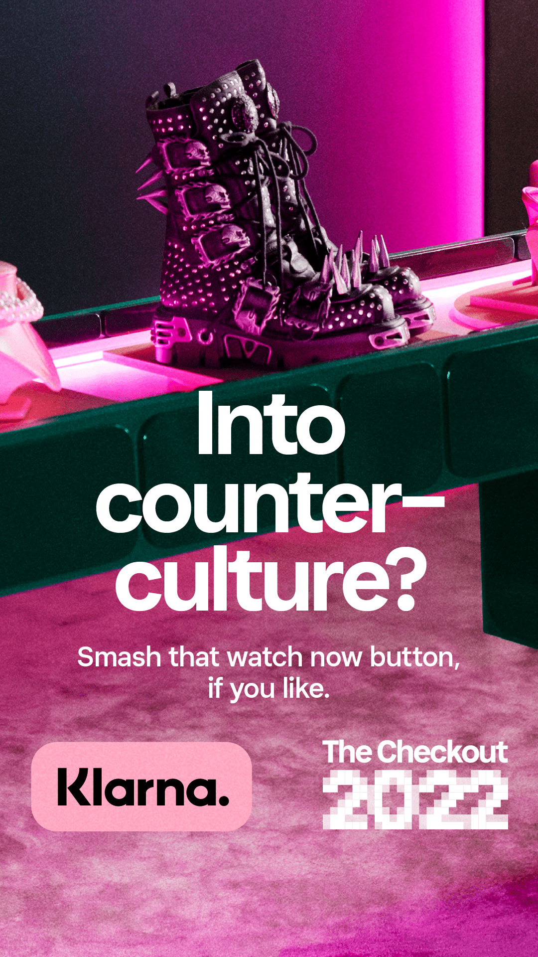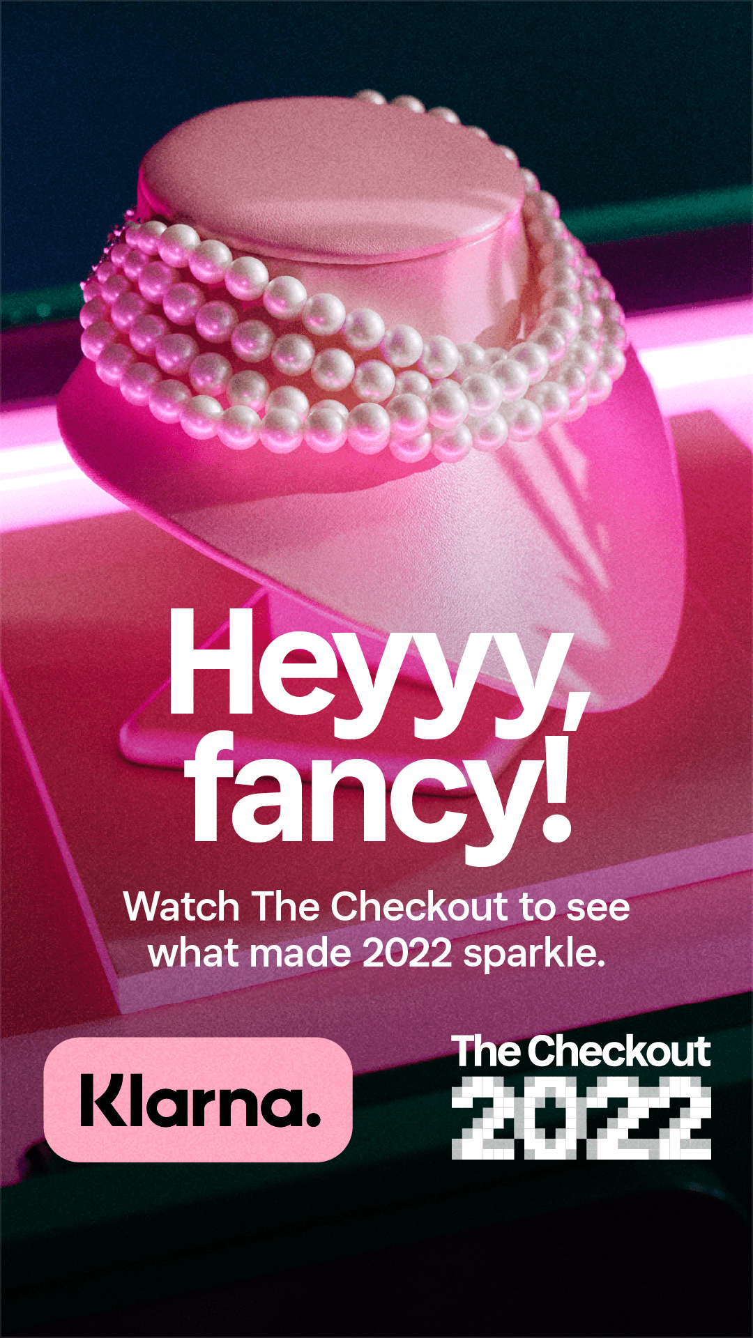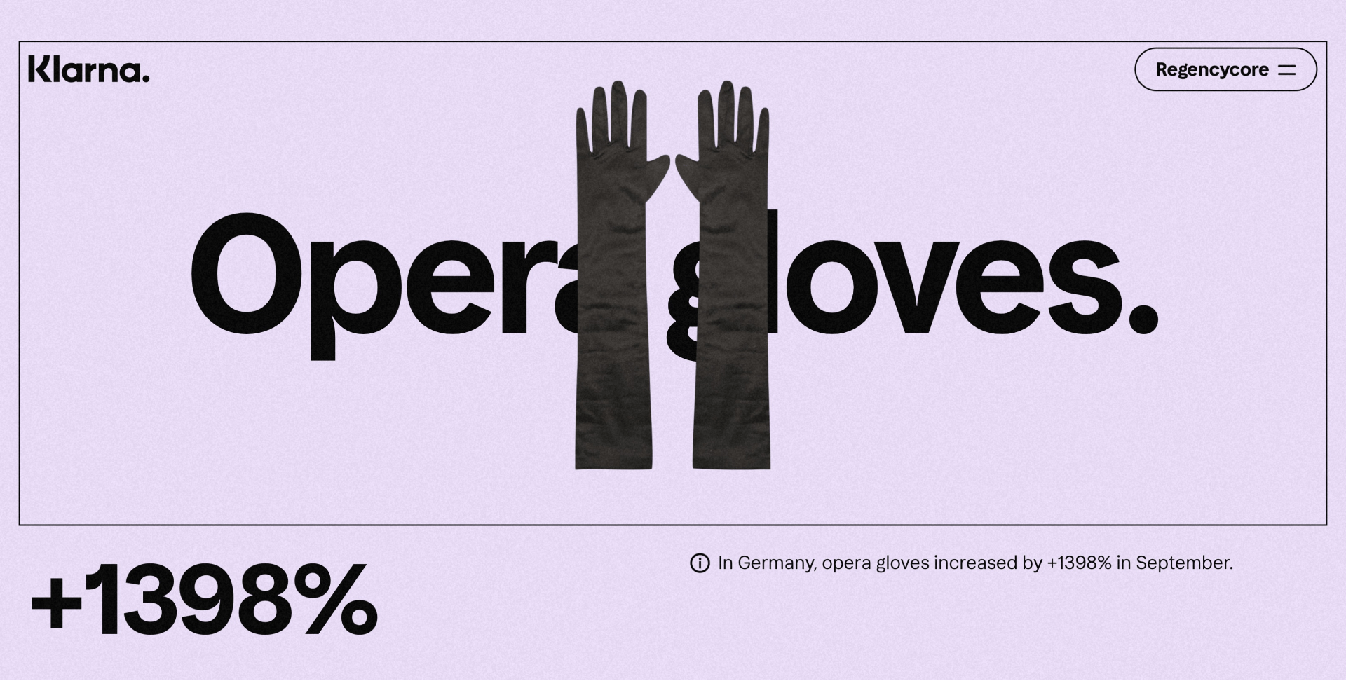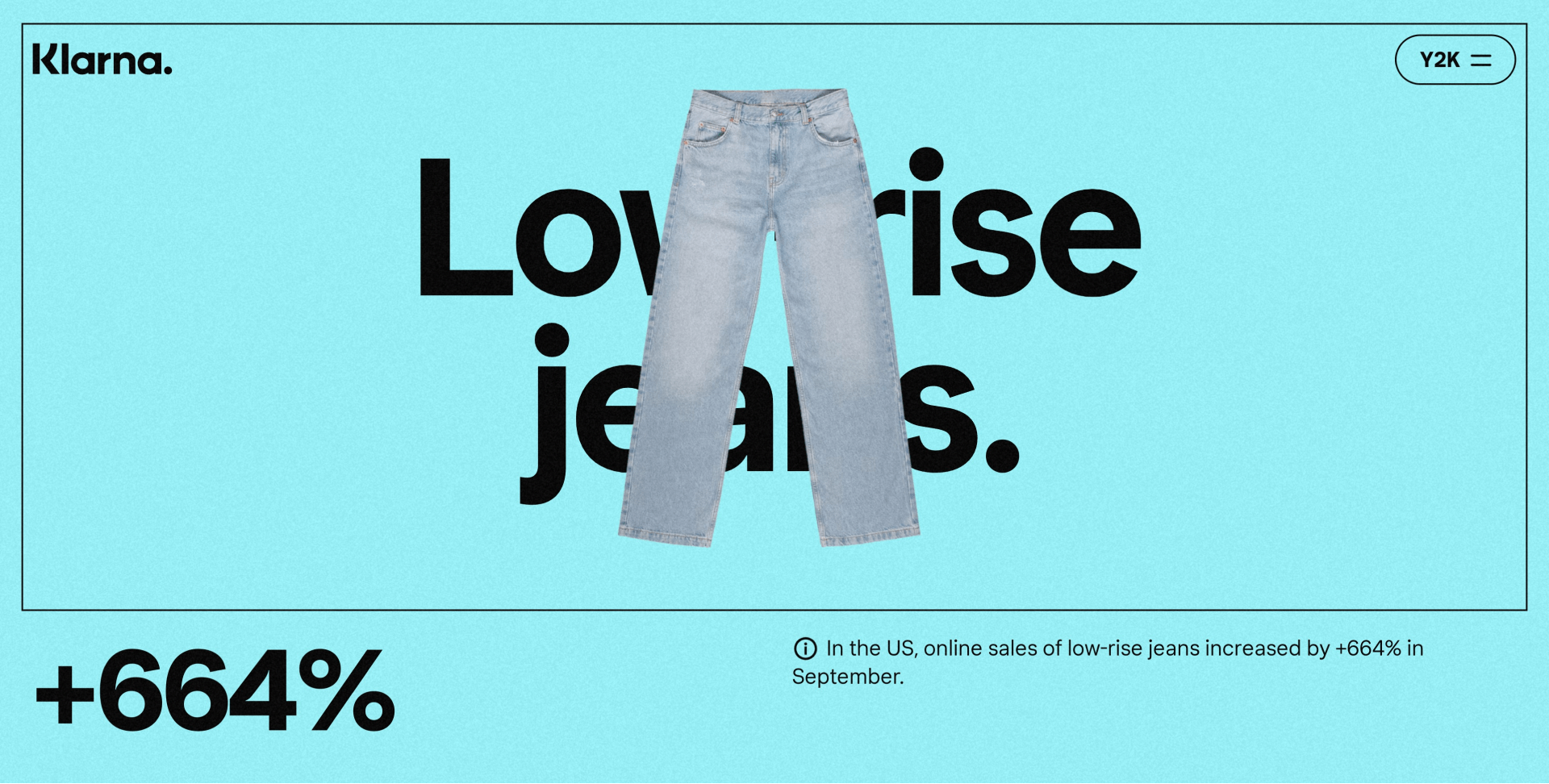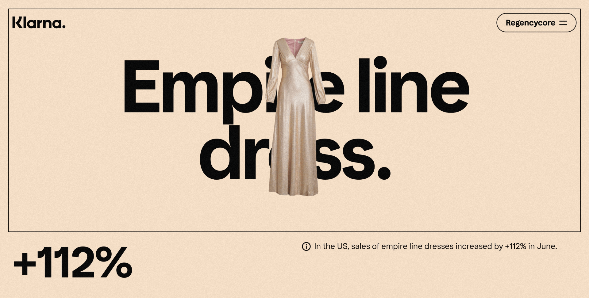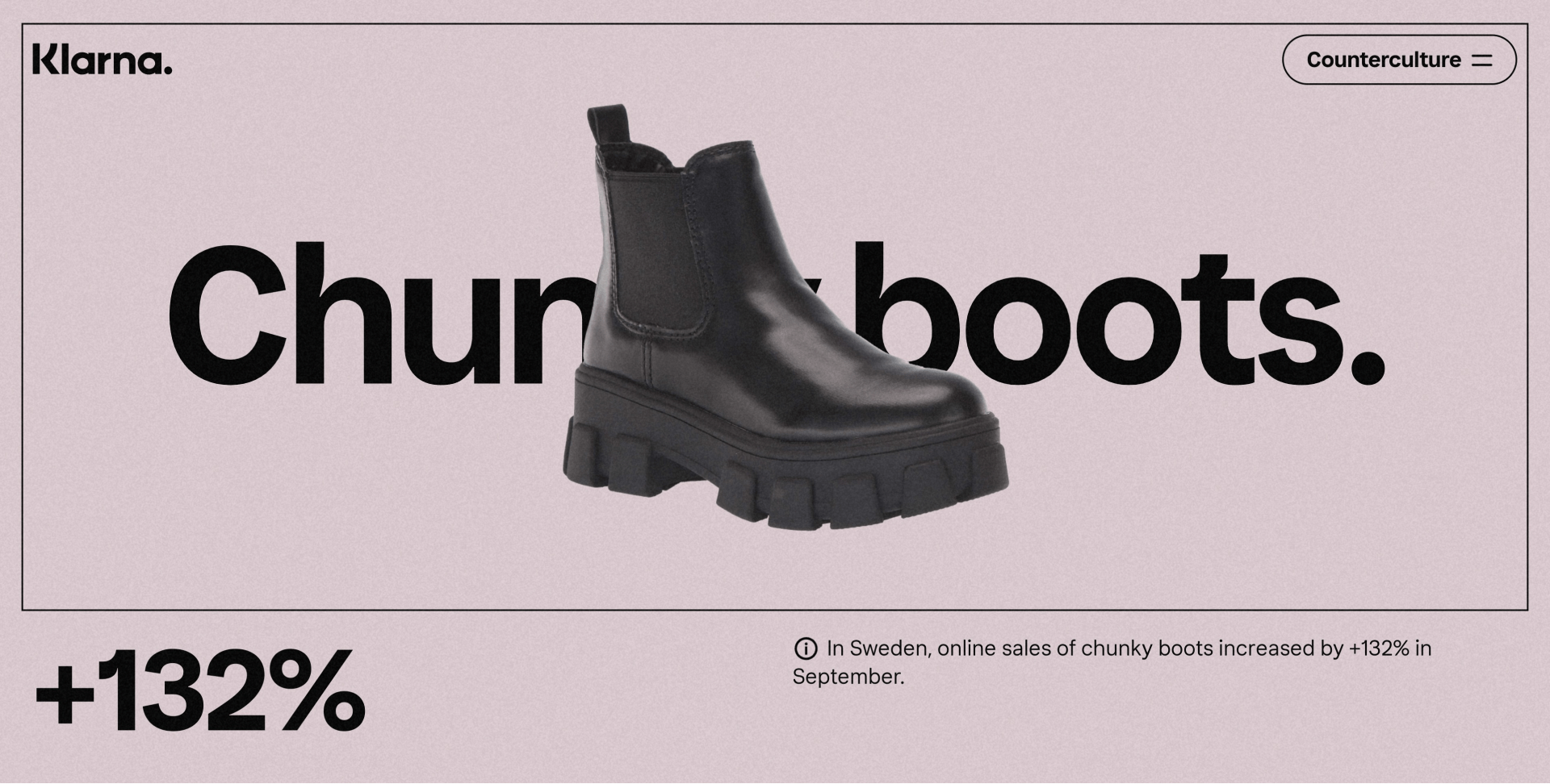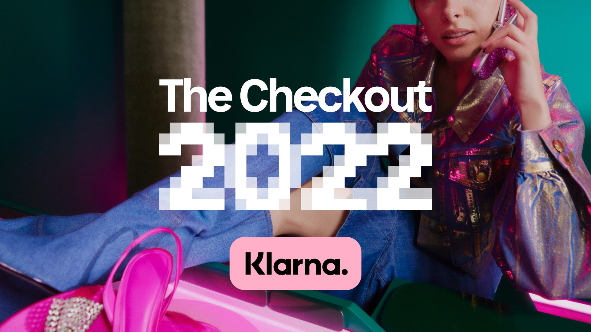
2022 was a collective blast from the past across fashion, technology, and culture. This resulted in a clear theme for Klarna’s first report:
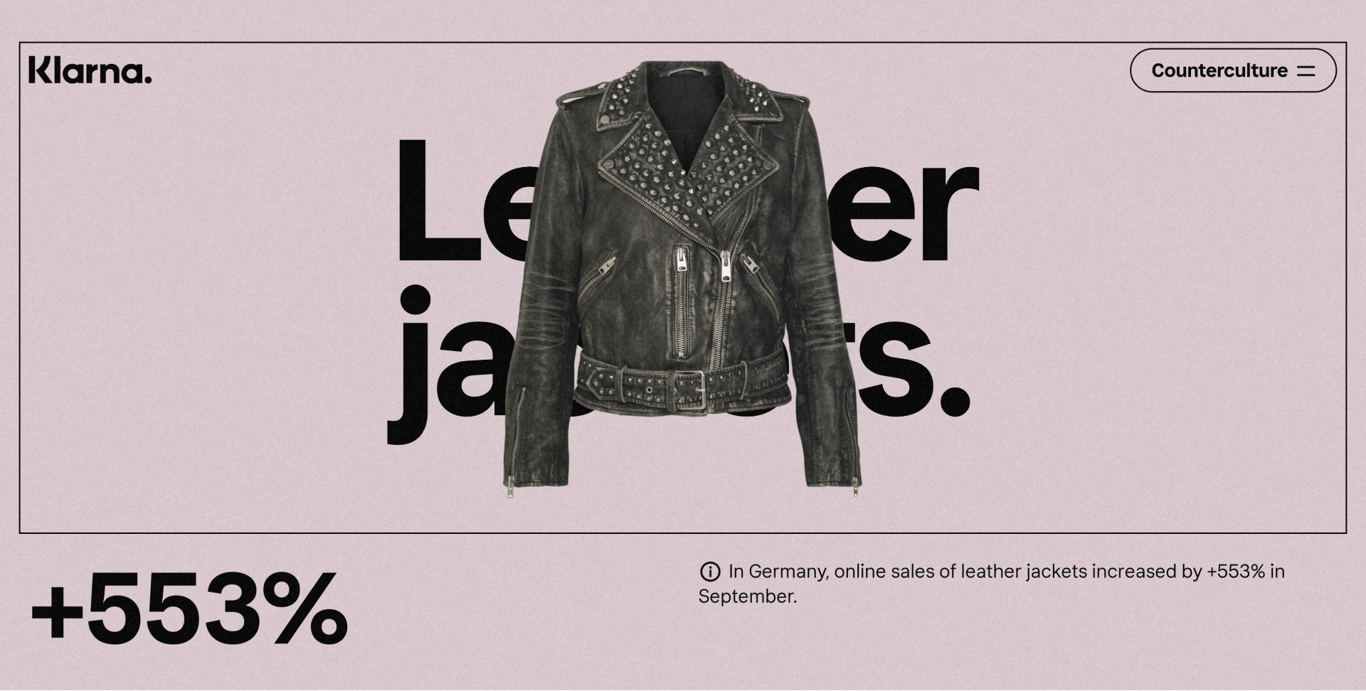
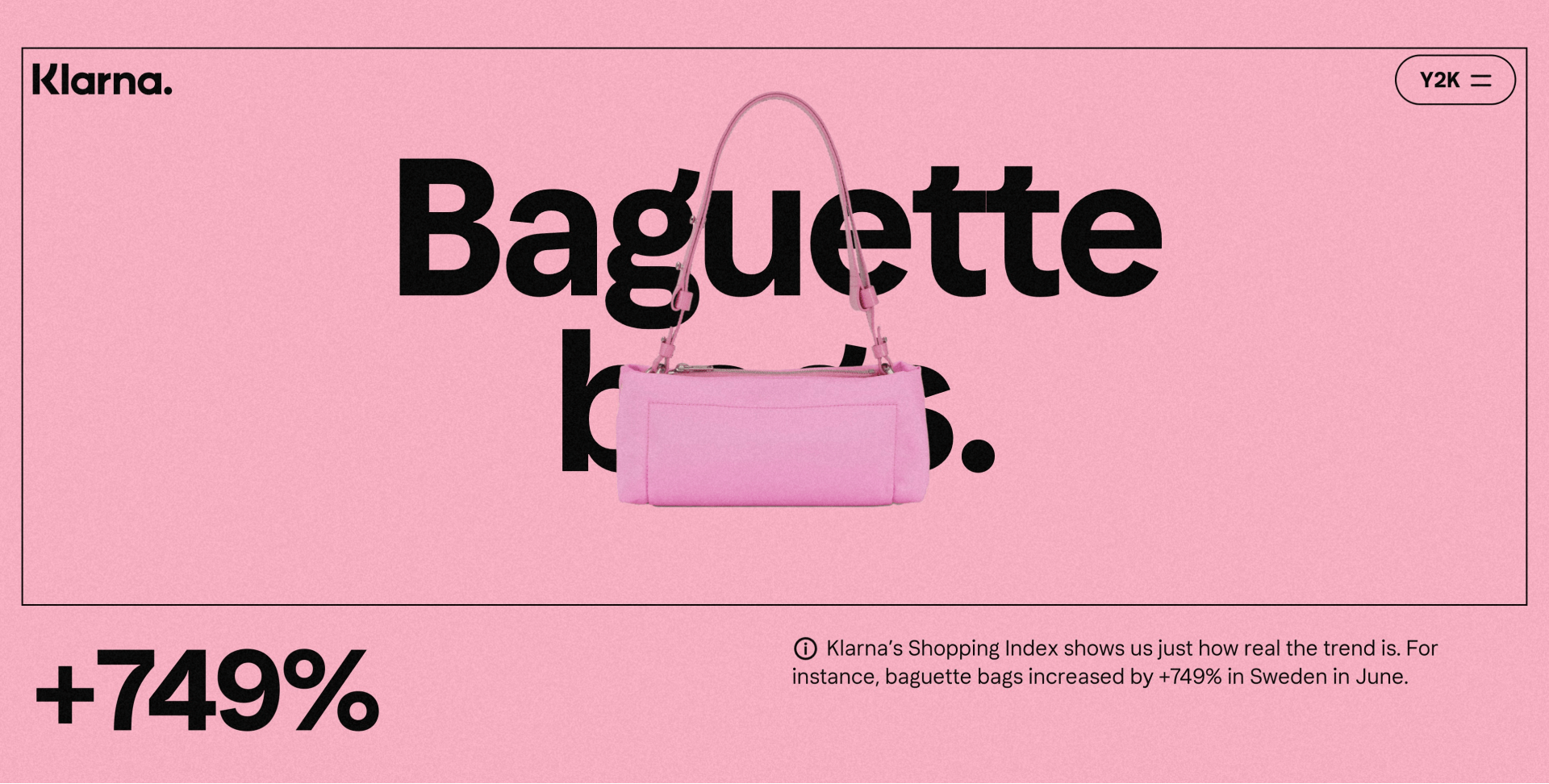
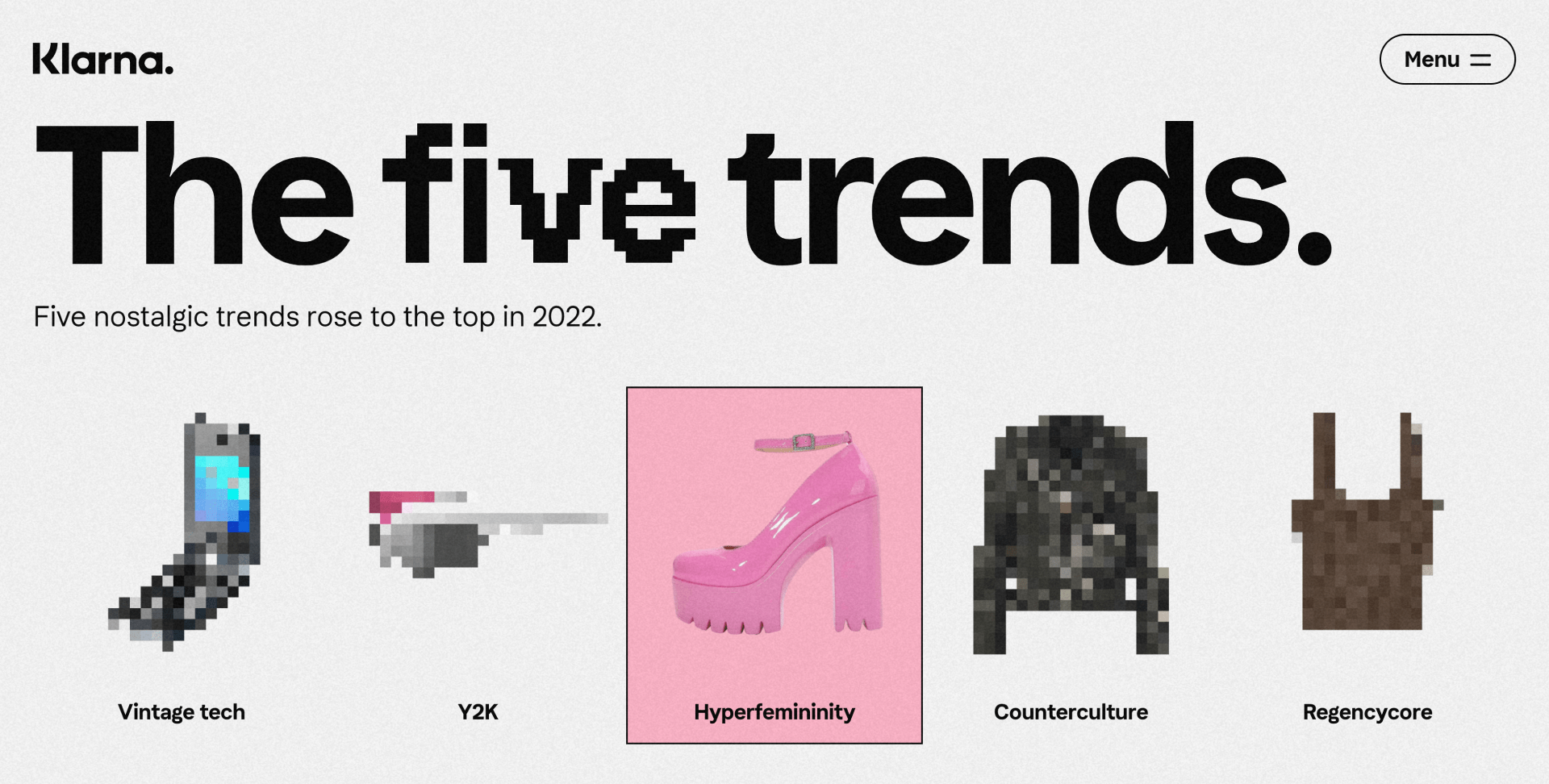
From flip phones to racer sunnies, a lot of things from recent memory became classics. Five defining trends were identified.
These trends were narrated by expert Agus Panzoni @thealgorythm who became the face and voice of The Checkout.
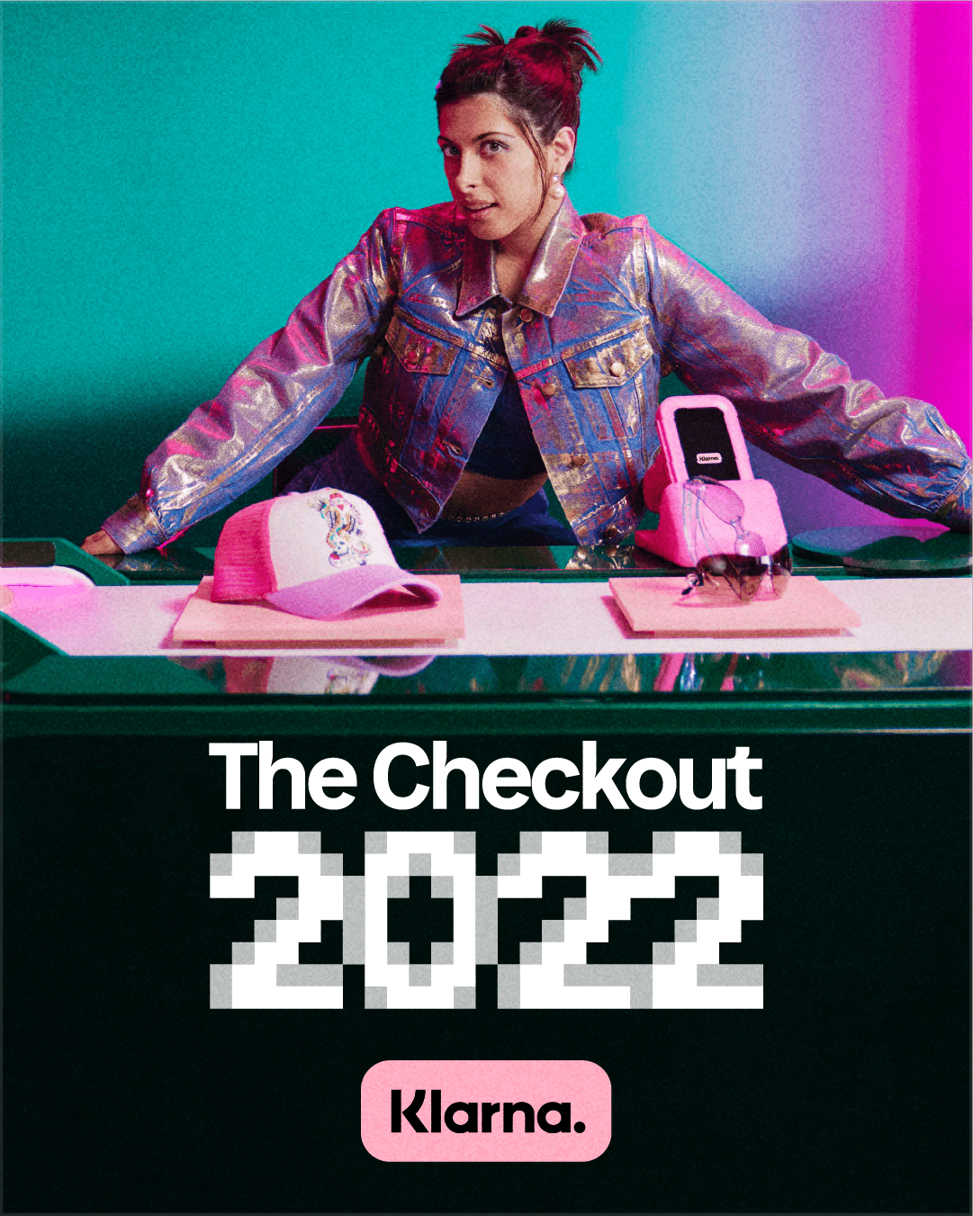
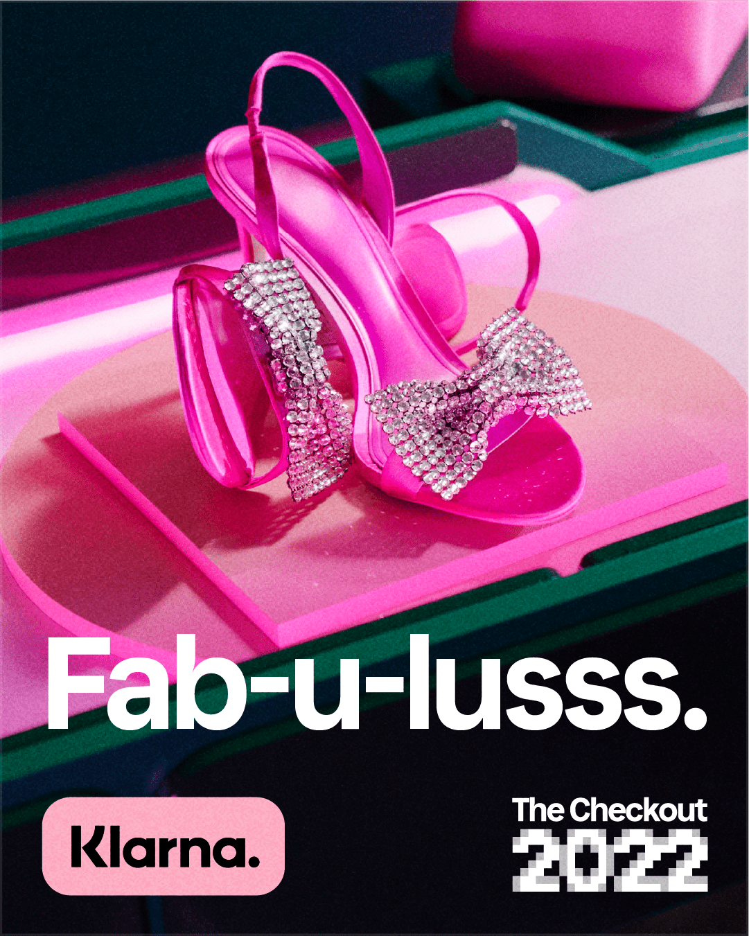
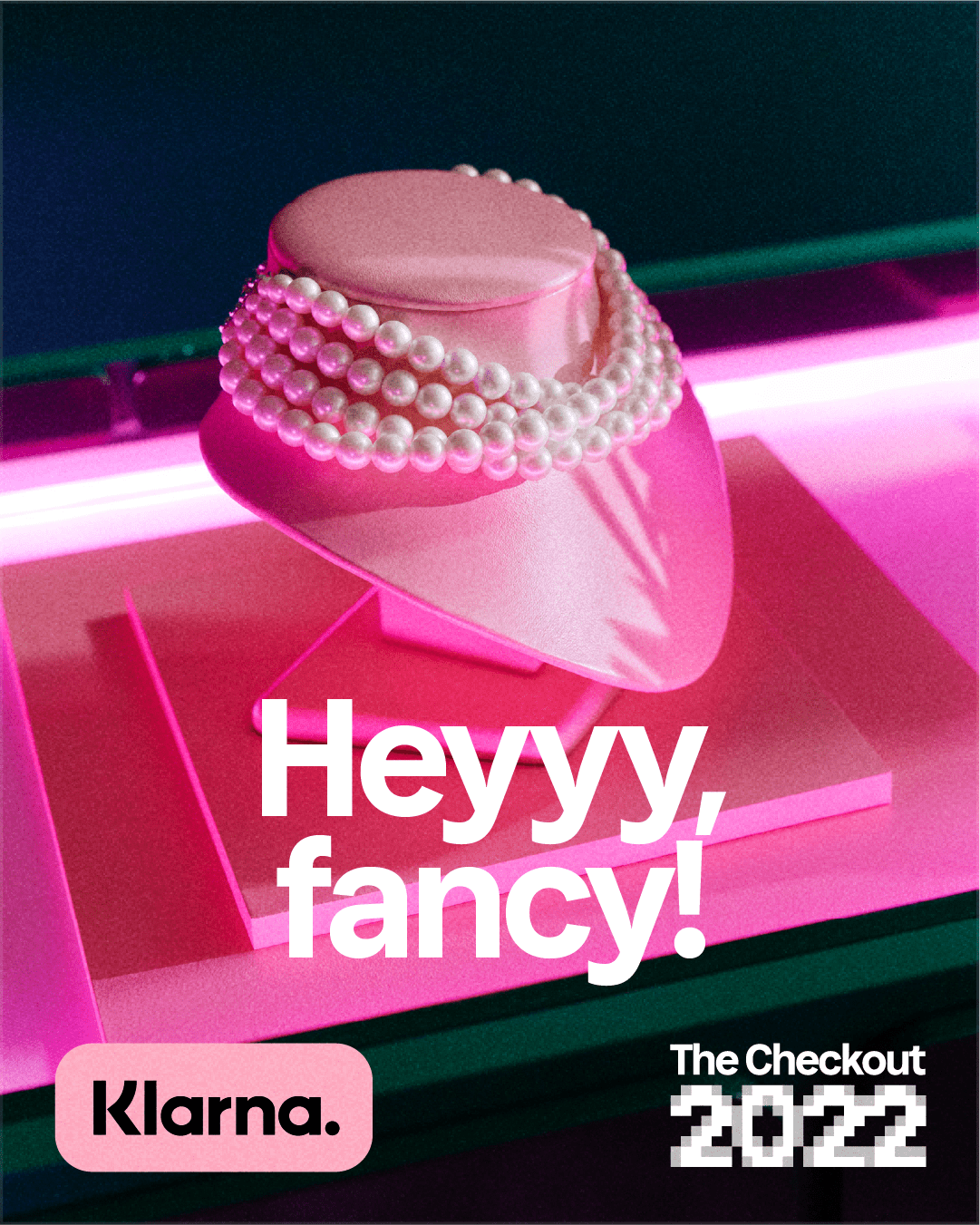
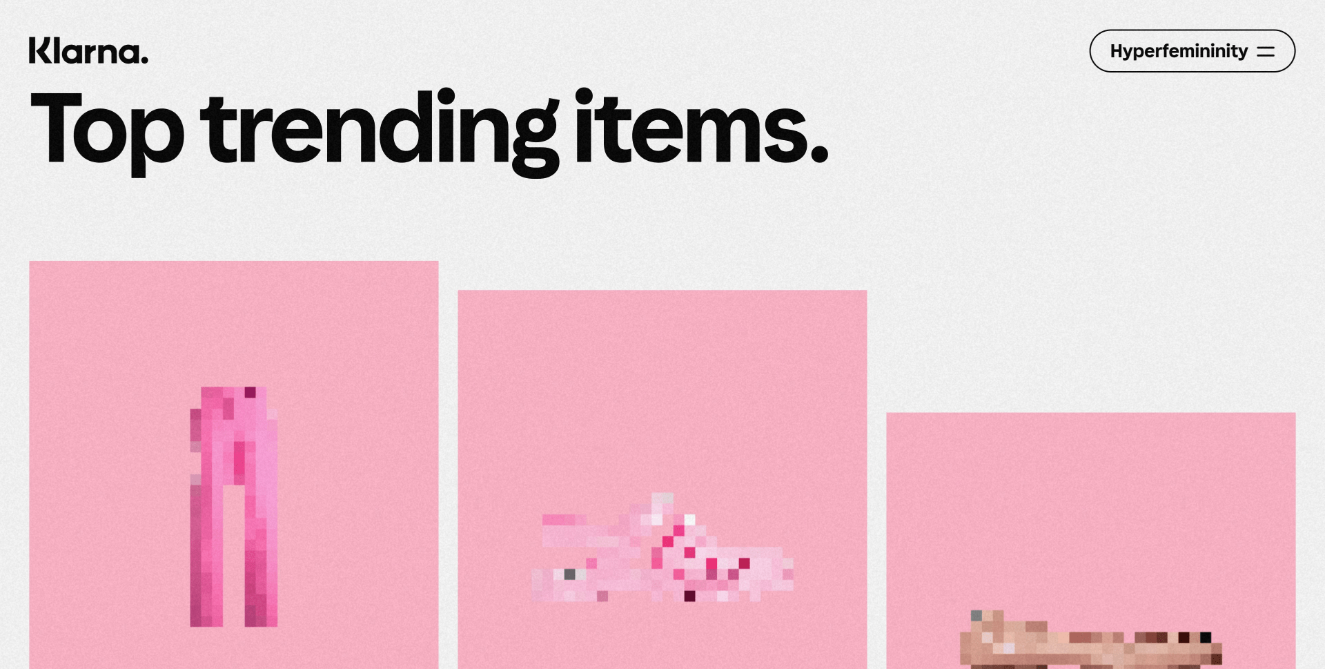
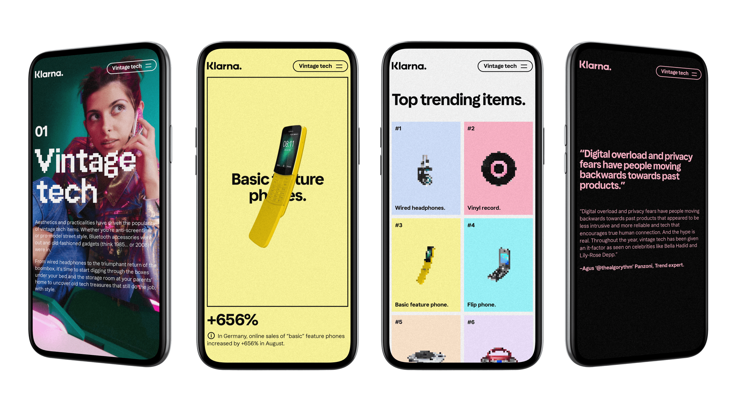
The pixel became a natural component for throwback visuals. Mixing low-resolution graphics, colorful imagery and typography in a modern context.
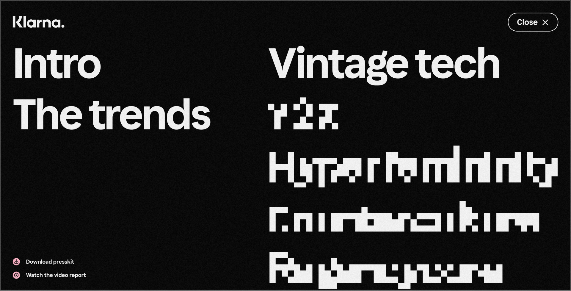
We used the pixels as a style and grid, but also as an incentive to click. Putting them in two different categories, Legible and Hinted.
We wanted to make sure the website never felt static, so we made use of triggers, scrolls and hover effects. Playing with colors, type animations and layout together with Klarna’s pink presence.
Mockups by Marcus Löfvenberg
Credits
Marcus Löfvenberg
